Vue.js Chatbot - Part 1: The Front-End

Generated with DALL-E 3
It can be daunting to get started on creating your own custom webapp, especially if you’re not a web developer. There are lots of nice design tools out there, but you lose some of the granular control if you don’t code it yourself. As someone who’s not a web developer, I’ve found that Vue.js is a great framework to get started with. It’s easy to learn, and has a lot of great documentation and community support. In this series, I’ll be showing you how to build a chatbot using Vue.js, and how to integrate it with a back-end API that will be interacting with the GPT-3.5 model. As a cherry on top, we will look at how to store the messages in a MongoDB database, so that we can use them later for other uses.
If you want to jump straight to the finished product, you can find it at the code repository here.
In this part we will be working up to this commit.
What is Vue.js?
Vue.js is a JavaScript framework for building user interfaces. It’s a progressive framework, which means that you can start small and scale up as you need to. This is especially helpful when you are trying to learn the ropes of front-end development. Vue.js is very flexible, and can be used to build single-page applications, or to add interactivity to existing webpages. It’s also very lightweight, and has a small footprint, which makes it a great choice for building webapps that need to be fast and responsive. Check out some more info on Vue.js here.
Let’s get started!
To get started, we’ll need to install Node.js and npm. You can find the installation instructions here. Once you have Node.js and npm installed, you can create a new Vue.js project by running the following command in your terminal at the location where you want to create your project:
npm create vue@latest
I named my project app, which will come into play later in the project. You can name your project whatever you want. Once you’ve created your project, you can navigate into the project directory and run the following command to start the development server:
npm run dev
Navigate to the URL in the terminal and you should see your first webapp! Congrats! You’re now a web developer! 🎉
Chatbot Bones
OK, maybe not a web developer, but you are on your way! Now that we have the Vue.js app created. Let’s look at the structure.
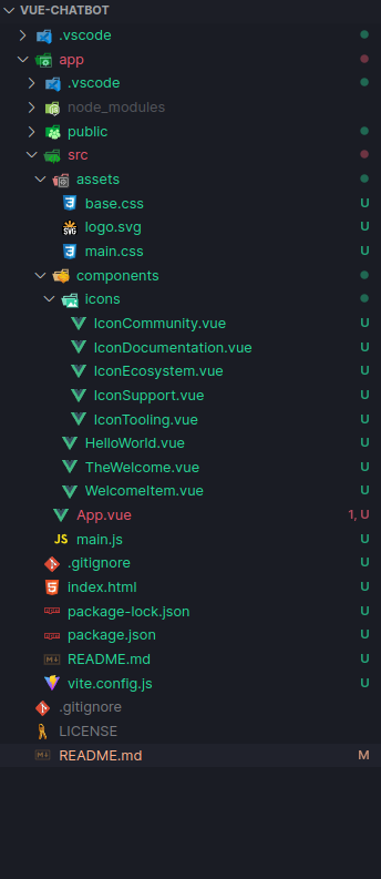
The basic Vue.js web app structure. All of the project files are located in the `app/` directory
We can get rid of a lot of those files because we do not need them for our project. Delete everything inside the components/ directory. From here we are going to build out components for the different pieces of our app. This is the power of things like Vue.js and React because we can reuse components with potentially different information in them. This will really come in handy later…
Within the components/ directory, let’s make our first component ChatContent.vue, and place the following code in it.
ChatContent.vue
<script>
export default {
    name: 'ChatContent',
    components: {
    }
}
</script>

<template>
    <div class='chat-content'>
        <h1>Chat Content</h1>
    </div>
</template>

<style scoped>
.chat-content {
    background-color: #eda9f9;
    border-radius: 10px;
    box-shadow: 0 0 10px rgba(0, 0, 0, 0.2);
    height: 100%;
    padding: 1rem;
    width: 100%;
}
</style>
We can see that this is a mix of HTML, JavaScript, and CSS. Later, this component will be the container for our chat messages, but for now, it is just a purple box with “Chat Content” written in it. The script portion merely exports the component name for right now, the <template> contains our HTML with a basic <div> element that will hold our content, and the style portion applies some basic styles to our <div> element by referencing its class name. We are using the scoped attribute to ensure that these styles only apply to this component. This is a handy feature of Vue.js because it allows us to use the same class names in different components without worrying about them conflicting with each other.
Next, let’s create one more component which will be the container for the input row at the bottom of the chat window. Create a new file called InputRow.vue and place the following code in it.
InputRow.vue
<script>
export default {
    name: 'InputRow',
    components: {
    }
}
</script>

<template>
    <div class='input-row'>
        <h1>Input Row</h1>
    </div>
</template>

<style scoped>
.input-row {
    background-color: #f6db99;
    border-radius: 10px;
    box-shadow: 0 0 10px rgba(0, 0, 0, 0.2);
    height: 100%;
    padding: 1rem;
    width: 100%;
}
</style>
This component is very similar to the ChatContent.vue component, but it is a yellow box instead of a purple box. We will use this component to hold the input field and send button.
Your components/ directory should now look like this
components/
├── ChatContent.vue
└── InputRow.vue
Now we actually need them to display on the screen. Back in App.vue, let’s update it to import our components and display them. Here is the updated App.vue file.
App.vue
<script setup>
import ChatContent from './components/ChatContent.vue'
import InputRow from './components/InputRow.vue'
</script>

<template>
  <div class="app">
    <ChatContent />
    <InputRow />
  </div>
</template>

<style scoped>
</style>
The ChatBubble Component
Remember when I said that components are handy because we can reuse them? This is why! We are going to create ChatBubble.vue which we will use to display the chat messages in ChatContent.vue. Create a new file called ChatBubble.vue within your components/ directory and place the following code in it.
ChatBubble.vue
<script>
export default {
    name: 'ChatBubble',
    components: {
    }
}
</script>

<template>
<div class="chat-bubble">
    <div class="chat-bubble-content">
        Test
    </div>
</div>
</template>

<style scoped>
.chat-bubble {
    background-color: #f6f8d0;
    margin-bottom: 10px;
}
</style>
This creates a simple box with the text “Test” in it. Now, going back to ChatContent.vue, we can import the ChatBubble.vue component and use it to display the “chat messages”. Here is our updated ChatContent.vue component.
ChatContent.vue (updated)
<script>
import ChatBubble from './ChatBubble.vue'

export default {
    name: 'ChatContent',
    components: {
        ChatBubble,
    }
}
</script>

<template>
    <div class='chat-content'>
        <ChatBubble/>
        <ChatBubble/>
        <ChatBubble/>
        <ChatBubble/>
        <ChatBubble/>
    </div>
</template>

<style scoped>
.chat-content {
    background-color: #eda9f9;
    border-radius: 10px;
    box-shadow: 0 0 10px rgba(0, 0, 0, 0.2);
    height: 100%;
    padding: 1rem;
    width: 100%;
}
</style>
Notice the import statement at the top of the <script> portion, the ChatBubble within the components object, and the <ChatBubble/> components in the actual template. This displays 5 chat bubbles with “Test” in the chat content area screen. Later we will adapt this to display the actual chat messages.
Updating the InputRow Component
Let’s add a simple text box and button to our InputRow.vue component. Here is the updated InputRow.vue component.
InputRow.vue (updated)
<script>
export default {
    components: {
    }
}
</script>

<template>
    <div class='input-row'>
        <textarea></textarea>
        <button>Send</button>
    </div>
</template>

<style scoped>
.input-row {
    display: flex;
    background-color: #f6db99;
    border-radius: 10px;
    box-shadow: 0 0 10px rgba(0, 0, 0, 0.2);
    padding: 1rem;
    width: 100%;
}
</style>
The chatbot is starting to look a little more familiar now! We have a chat content area, and an input row with appropriate features. Hopefully your app looks something like this!
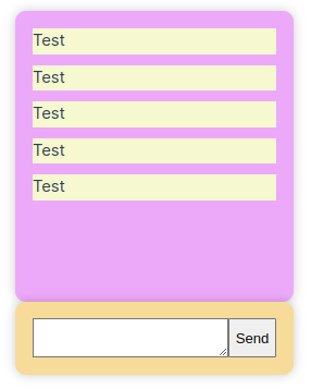
Our app is starting to look like an actual chatbot app! But is has no real functionality...
Props and List Rendering
One of the powerful features of Vue.js is the ability to pass data between components. We can do this using props. Props are properties that we can pass from a parent component to a child component. Let’s update our ChatBubble.vue component to accept a prop called message. Here is the updated ChatBubble.vue component.
ChatBubble.vue (updated)
<script>
export default {
    name: 'ChatBubble',
    props: {
        message: {
            type: Object,
            required: true,
        },
    },
}
</script>

<template>
<div :class="['chat-bubble', message.role]">
    <div class="chat-bubble-avatar">
        {{ message.role[0].toUpperCase() }}
    </div>
    <div class="chat-bubble-content">
        {{ message.content }}
    </div>
</div>
</template>

<style scoped>
.chat-bubble {
    display: flex;
    align-items: center;
    flex-direction: row;
    margin-bottom: 10px;
}

.chat-bubble.assistant {
    flex-direction: row-reverse;
}

.chat-bubble-avatar {
    background-color: #e1e1e1;
    border-radius: 50%;
    color: #000;
    font-weight: bold;
    height: 40px;
    line-height: 40px;
    margin-right: 10px;
    text-align: center;
    width: 40px;
    margin: 0px 10px;
}

.chat-bubble-content {
    border-radius: 10px;
    padding: 10px;
}

.user .chat-bubble-content {
    background-color: #f6db99;
}

.assistant .chat-bubble-content{
    background-color: #f6f8d0;
    text-align: right;
}
</style>
Notice we actually style the bubble as well and give it some personality depending on if the bubble is for the user or the bot. The message object stores key information such as the “role” of the message (user or assistant), and the content of the message. These are then displayed within the appropriate portions of the component and accessed through the double curly brackets (e.g., {{ message.content }}). Now, let’s update our ChatContent.vue component to pass the message prop to the ChatBubble.vue component. Here is the updated ChatContent.vue component.
ChatContent.vue (updated)
<script>
import ChatBubble from './ChatBubble.vue';

export default {
    name: 'ChatContent',
    components: {
        ChatBubble,
    },
    data() {
        return {
            messages: [
                { role: 'user', content: 'Hello' },
                { role: 'assistant', content: 'Hi, how are you?' },
                { role: 'user', content: "I'm fine, thanks." },
                { role: 'assistant', content: 'Good to hear.' },
                { role: 'user', content: 'Bye.' },
            ],
        };
    },
};
</script>

<template>
    <div class="chat-content">
        <ChatBubble
            v-for="(message, index) in messages"
            :key="index"
            :message="message"
        />
    </div>
</template>

<style scoped>
.chat-content {
    background-color: #eda9f9;
    border-radius: 10px;
    box-shadow: 0 0 10px rgba(0, 0, 0, 0.2);
    height: 100%;
    padding: 1rem;
    width: 100%;
}
</style>
Within the data() function, we created a fake array of messages which will eventually be replaced by a prop from the App.vue component. For now, this provides us with some test data to work with. Furthermore, if you notice where we call the ChatBubble component in the <template> we are using the v-for directive to loop through the messages array and display a ChatBubble component for each message. We are also passing the message object to the ChatBubble component using the :message prop. This is how we pass data between components. Now, our chatbot should look something like this!
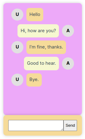
Our chatbot is starting to look like a real chatbot! But it still has no real functionality...
Make it look nice
OK, we need to make this app look a little nicer. Right now the colors are kind of hideous and everything is tiny. Let’s add some style to our app by modifying the main.css file within the assets/ directory and adding some custom CSS to each of our components including the App.vue component. Here are what the 5 files’ styles look like now.
main.css
@import './base.css';
App.vue
.app {
  display: flex;
  flex-direction: column;
  align-items: center;
  height: 100vh;
  width: 100vw;
  margin: 0;
  padding: 0;
}

.app-content {
  display: flex;
  flex-direction: column;
  flex-grow: 1;
  padding: 1rem;
  width: 100%;
  max-width: 1000px;
  overflow: auto;
}
ChatContent.vue
.chat-content {
    background-color: #f4f8ff;
    border-radius: 10px;
    box-shadow: 0 0 10px rgba(0, 0, 0, 0.2);
    height: 100%;
    padding: 1rem;
    width: 100%;
    margin-bottom: 10px;
    overflow: auto;
}
ChatBubble.vue
.chat-bubble {
    display: flex;
    align-items: center;
    flex-direction: row;
    margin-bottom: 10px;
}

.chat-bubble.assistant {
    flex-direction: row-reverse;
}

.chat-bubble-avatar {
    background-color: #e1e1e1;
    border-radius: 50%;
    color: #000;
    font-weight: bold;
    height: 40px;
    line-height: 40px;
    margin-right: 10px;
    text-align: center;
    width: 40px;
    margin: 0px 10px;
    box-shadow: 0 0 5px rgba(0, 0, 0, 0.2);
}

.chat-bubble-content {
    border-radius: 10px;
    padding: 10px;
    box-shadow: 0 0 5px rgba(0, 0, 0, 0.2);
}

.user .chat-bubble-content {
    background-color: #f6db99;
}

.assistant .chat-bubble-content{
    background-color: #f6f8d0;
    text-align: right;
}
InputRow.vue
.input-row {
    display: flex;
    align-items: stretch;
    background-color: #fdf0d7;
    border-radius: 10px;
    box-shadow: 0 0 10px rgba(0, 0, 0, 0.2);
    padding: 10px;
    width: 100%;
}

textarea {
    flex-grow: 1;
}

.input-row button {
    background-color: #f0e6fb;
    border: none;
    border-radius: 5px;
    padding: 10px;
    cursor: pointer;
    color: #00000089;
    box-shadow: 1px 2px 3px rgba(0, 0, 0, 0.25);
    transition: background-color 0.2s ease-in-out, box-shadow 0.1s ease-in-out;
    margin-left: 10px;
}

button:hover {
    filter: brightness(0.9);
}

button:active {
    box-shadow: none;
}
Now we are looking good!
Here is what our chatbot looks like now!
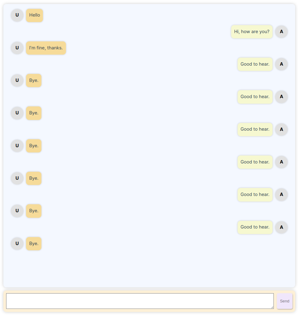
Some style makes it feel so much nicer. I added a ton of messages to test the scrolling ability.
That’s it for the front-end for now
In the next part we will look into the FastAPI back-end and how to integrate it with our front-end. In a later part we will tackle the MongoDB database.
You can take a look at all of this code at this point by navigating to specific GitHub commit here.
Enjoy Reading This Article?
Here are some more articles you might like to read next: